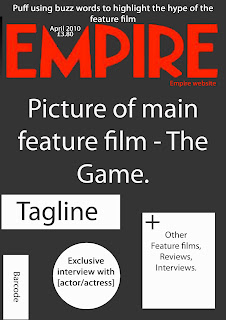
After much research on magazine front covers, I found many similar features running throughout each magazine. I chose to have my magazine as an Empire magazine as it was the one I was more familiar with as apposed to Total Film magazine. My mock up shares many of the conventions that Empire use, for example, Empire have used circles to emphasise features of the magazine, using buzz words they highlight features such as interviews or exclusive special features that can only be seen in Empire. Furthermore, they always have a 'plus' sign and/or the word plus to highlight other special features that film fans would like to see and the font
is always in the same colour or theme as the rest of the magazine. The date and price is always in between the 'M' of Empire and the Empire website is always at the bottom right hand side of the Empire logo. I have chose to have a puff above the title as, when I have been researching, the covers with puff's above the title are the one's that stand our to me more. The main image always fills the page on the cover of Empire, it also has a large title and a tag line underneath, moreover it more or less always has puffs surrounding it promoting the film.
No comments:
Post a Comment